WhatsApp, Dark mode, and many more new features are now available! ![]()
Read all about this update:

WhatsApp, Dark mode, and many more new features are now available! ![]()
Read all about this update:
Loving the update! Definitely a nice refresh, and keeps my teams on their toes - I’m just updating guidance for using the platform ![]()
I’ll also be exploring the integrations.
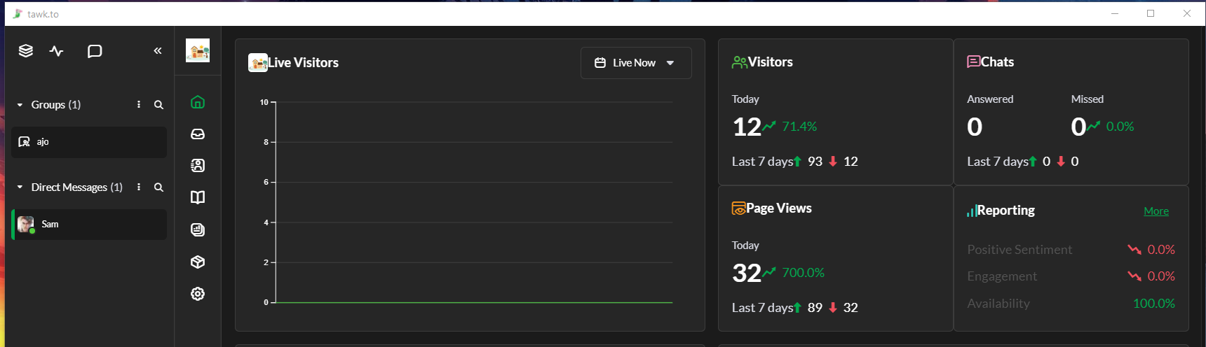
Is there an option to change the vertical navigation to a horizontal layout? Contrary to the space-saving intention mentioned in the release notes, it actually takes up more space for us since we use multiple vertical panes when handling several chats. The positioning also feels off, as it sits between the notification/new-chat pop-up window and the chat window. I hope this can be considered. Thank you!
Hi @Rowm, thanks for your feedback! I completely understand where you’re coming from. Like with all changes, there are always trade-offs. We believe this design will be beneficial for most users.
Have you tried collapsing the chat list on the left side to create more space?
From experience, I’d also recommend using the TAB key to switch between multiple chats. This works regardless of whether you’re in the 1, 2, 3 or 4 chat view.
Thank you for your suggestions.
Collapsing the chat list works only if we do not need to continually check and respond to new chats. Since there is currently no option to automatically assign chats to an agent, we need to keep that window open at all times to monitor incoming messages. Because of this, collapsing it to create more space is not an ideal solution.
If there were an option to switch the navigation layout between vertical and horizontal, that would be extremely helpful. The top horizontal section has plenty of unused space, while the vertical navigation, which is where most of the activity happens, feels cramped.
This is just something I hope can be considered. Thank you.
Just wanted to report a small visual issue with the new layout when using the windows desktop app where lots of the icons look too close to the adjoining text and need some padding (See screenshot). This is not the case on the web based version of the panel which i just loaded up.
Hi @SpinDreams ,
Thanks for bringing this to our attention! We appreciate you taking the time to report the visual issue and for sharing the screenshot. I’ve forwarded this to our team for review and further checking. Thanks again for letting us know!
Is there any plan to add sound and visual alerts for messages received from WhatsApp and Messenger?
Yes, we’re working on it!
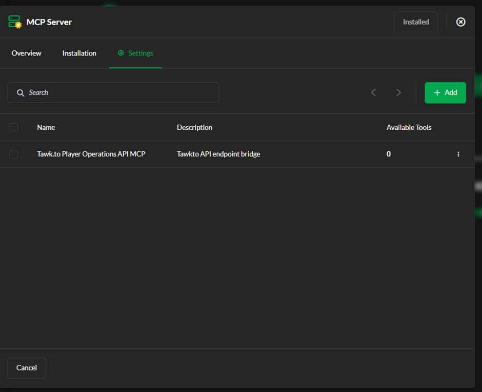
@JethroPaul How can I implement the MCP server into my AI assist chat bot?
Can you send me documentation?
I have tried to add the API integration, however in the Available Tools it shows 0.
I don’t know how to correctly setup my endpoints since I don’t know what kind of automation is working behind the scenes and would be good to know.
Hi @matjaz, thanks for your query.
Primarily, I’d like to point out that this thread is not related to your question. Moving forward, please either post your question on a relevant thread, or create a new one.
For quick support, you can start a chat on our website - tawk.to. If our AI agent does not suffice, you can request to speak with a human. Our team is available 24/7-365.
To address your question, it would appear that your API schema doesn’t expose any tools, which is why none appear in “Available Tools.” We wouldn’t be able to tell more without seeing the code in your schema file.
RIght, thanks for pointing it. I will write you a message instead