The bright green tooltip/hover background color with white text is really hard to read. Can you fix it?
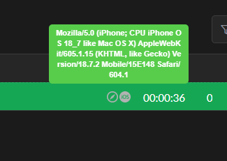

The bright green tooltip/hover background color with white text is really hard to read. Can you fix it?
Hi Mcostantini,
Thank you for bringing this to our attention!
The bright green background on the hover tooltip is part of the current default UI design, and at the moment, it isn’t customizable from the dashboard. I understand how the contrast can make the text difficult to read, especially on certain screens.
I’ve forwarded your feedback to our Product Team so they can review the color contrast and consider improvements in future UI updates. We really appreciate you pointing this out — suggestions like yours help us enhance the overall user experience.
If you notice any other areas that could be improved or have additional suggestions, feel free to share them anytime!
Regards,
Thanks… as a suggestion, black background would look good, bigger font too.