Feedback about the free profile property

Hi,

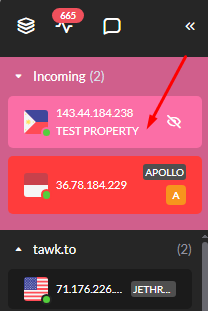
I find the (free profile) panel forcing its way there as a property, is a little more confusing for user experience, especially after a click on any button, you will get all the property selected indicating that this feature or page are shared between all those properties (Not sure about this behavior), and sometime a property will go solo selected, makes it unclear sometime with this behavior if the right property is selected or not.

Some time even when showing the indication of all properties selected in one place, in another place it will indicate that the selected is only one!

What else is that the colors to distinguish the difference between properties are rapidly changing with every page refresh, I uploaded a property profile image to make it easier to find from other property and it turned out that the upload of the image has to be saved first, (Not all settings has the Save button).

The bottom line here is that I didn’t need this profile or property to be added in the first place, and I don’t know why it’s forcing it’s way in the interface, plus you don’t have the option to either disabled it, or deleting it, tried once and it deleted all the properties with it!

I really wish for the upcoming updates to have a better user experience on this.

Whoever with me on this please vote and replay.

Thanks
Hello, @Ibry aarp mahjongg

You’re experiencing a few issues with the user interface of a software or web application, particularly with the profile panel settings and property selection. User experience (UX) design can indeed be complex, and it’s important for software to provide clear and consistent feedback to users.

Here are a few suggestions that might help improve the situation:

Feedback to Developers: Provide detailed feedback to the developers of the application. Clearly outline the issues you’re facing with the profile panel settings and property selection, including the confusing behavior of the selection indicators and the rapidly changing colors.
User Interface Consistency: Suggest that the developers implement a more consistent and intuitive user interface design. This could include stable color coding for properties, clear selection/deselection indicators, and persistent settings across page refreshes.
Option to Disable/Delete: Request the ability to disable or delete profile or property settings if they are not needed. This feature should be implemented in a way that does not affect other properties.
Documentation and Support: Ask for better documentation and support to understand how to use the profile panel correctly and how to manage properties effectively.
Community Feedback: Engage with the community to see if others are experiencing similar issues and to gather support for changes. Community feedback can be a powerful motivator for developers to prioritize UX improvements.
User Testing: If possible, participate in user testing for upcoming updates to provide real-time feedback and suggestions for improvement.

I hope my suggestion is helpful for you.

1 Like

Thanks for the replay, I also made some edits and typo errors to clarify things better for the developers.

Thanks for the professional suggestions, they really makes the difference :slight_smile: