
See screenshot of Android device running Firfox browser below:
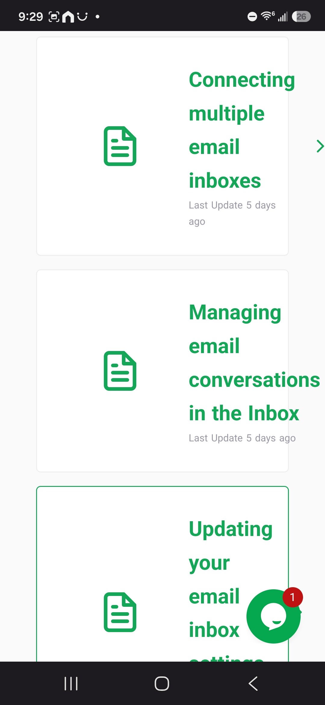
But also, do we really need the paper icon taking over 50% of that tile in the fist place?
Thanks for reporting this and for providing the screenshot.
I can confirm that the article cards don’t appear to be adapting correctly to the narrower screen, resulting in the content overflowing.
I’ll pass this along to our team as a responsive design issue. I’ll also include your feedback about the document icon taking up a large portion of the card, as reducing its size could provide more room for the article title and improve the mobile layout.
Regards,
Janice