
Hi WPTechGuru,
You may try to customize the position according to your preference, using JavaScript API.
Refer to the documentation here: Help Center | tawk.to | Customizing your widget placement with the JavaScript API
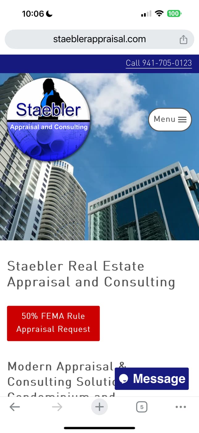
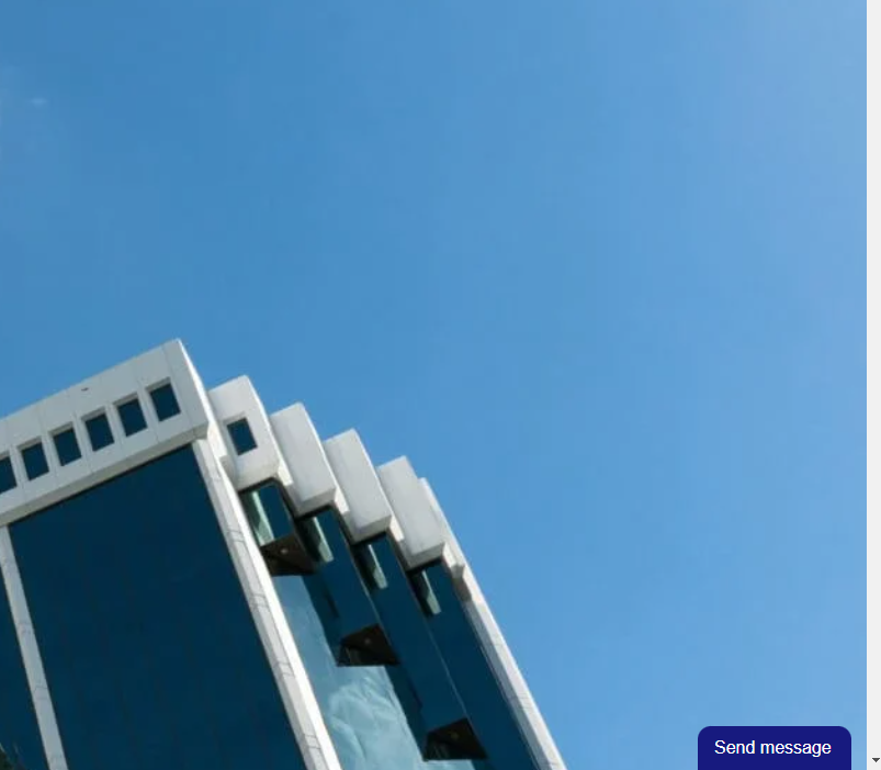
Here is my issue. It looks perfect on desktop, my assistant’s iphone (older) it looks perfect, on my android and my cilent’s phone it looks off, and it looks off
There is a gap underneath, on phones the font is different, the corners aren’t rounded etc. Should be consistent.
Desktop is perfect.
MOBILE BAD (and inconsistent)

Hi,
Thank you for presenting the samples. It is currently how the widget is designed when on mobile. Unless the website is checked using mobile, desktop view, it will look similar to the desktop version of the widget.
tawk.to widget icon, is really very ugly it looks giant on mobile devices.
Forgive me but sticking something to the bottom of a page is really easy with basic CSS. Why doens’t tawk.to fix this?