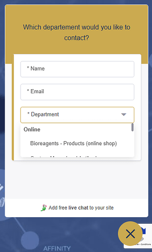
We have observed a problem with the design of drop-down fields. When a user clicks on a drop-down field, it displays only the first option, leading our customers to think that there is only one option. As a result, we lose potential customers, or the user’s request is sent to the wrong advisor, wasting our time. This user interface problem is really hurting our business, and we’d like to be able to display at least the first three options in the drop-down list. Any others suggestions are welcome…
Hi @webproteogenix, thanks for the feedback. Could you please share a screenshot so we can better understand the view and what the customer is seeing?
Thank you!
Hi @kristaps, thanks for your reply!
Sure!
As you can see, when a user opens the field, the dropdown only displays the first option. To view the others options, he must scroll down. But most of our visitors think that there are no other options.
Thanks
Thanks for bringing this to our attention, @webproteogenix! We’ll look into this as we touch on other widget-side updates.
Hi @kristaps I want to become a paying customer however this dropdown issue is a blocker, hard to believe it’s not fix while a lot of work is being done on AI at the same time.
Is there an update on this at all ?
