Hey, I find it almost infuriating that the Knowledge Base (KB), designed to share knowledge and help users, is not designed to fit different sizes of image media.
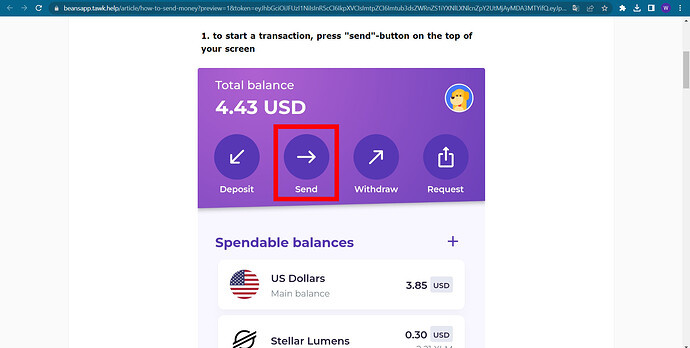
I am currently setting up the KB for an app we are building, and we use a lot of screenshots in our guides. However, we are faced with a very annoying and IMO non-needed choice: have the screenshots in their original size, which display correct on phones, or resize them to display them correct on PC.
In other words, they either show too big or too small on both platforms, making them unreadable on at least 1 platform. They are also not clickable or zoomable on mobile, which seems like a useful feature to have.
Suggested feature:
- Automatic resizing of images on desktop/mobil, making them readable
- Making images clickable and zoomable on phones
Thanks!
