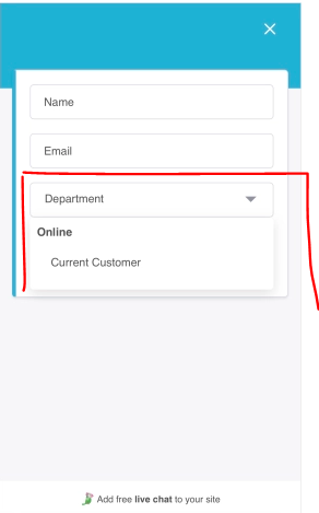
When you ask leads/clients to choose departments through a pre-chat form, it only shows them the first option (instead of at least a part of the list and an option to scroll this list).
It’s not intuitive for some users that they can scroll through the options and choose a suitable one because the form has no scroll bar or anything of this sort. If it’s possible to adjust the size of the list displayed or display at least a few options by default, that would both help the leads and look much better on the page cause look at all that empty space at the bottom.

.