Or let us write decent CSS ourselves (which was suggested a bunch of times) as this one is honestly terrible for 2024 standards. I’m not even a frontend dev and I could do better in 1 hour.
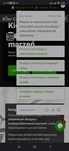
Just take a look:
I had to shift it few pixels to the top because something appears below it. Now the X button is barely accessible because everything is so chunky compared to big screen devices like laptops. What’s the point of margins being so huge on mobile devices? Why do the bubbles take up most of the screen?
1 Like
Hi @Destroy666,
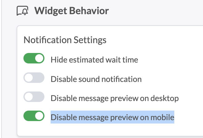
Thanks for pointing this out! To fix the overlap issue, go to Admin > Channels > Chat Widget, scroll to Widget Behavior, and toggle “Disable message preview on mobile.”

Ok, thanks, that looks to be like a temporary workaround. Although I’m not sure I need it as most clients aren’t affected anyways, just revisiting ones that accepted chat’s GDPR/data warning.
Doesn’t change the fact this 100% needs some reworks or configurability. It’s also bad for Tawk’s reputation that a widget looks like this on mobile - so while avoiding user CSS modifications is understandable for the same reason, not having a good look on mobile for common use cases like this has to be fixed IMO.
EDIT: one more idea: add option for widget scale in case you want to keep current design for whatever reason. But I it’s harder to implement on the other hand.
Thanks for the feedback. We’re currently working on a user-friendly redesign for the mobile trigger message preview.
1 Like

