Thank you so much for your response, I appreciate you consulting it with the team! @kristaps
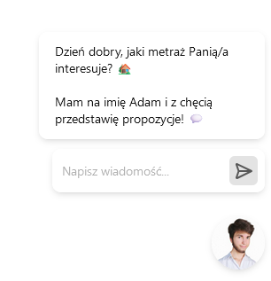
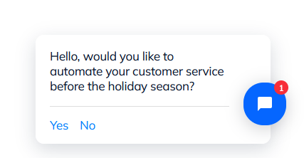
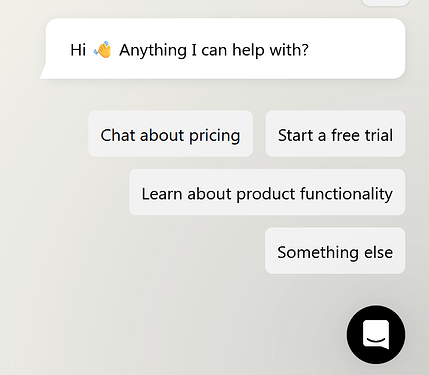
I’d consider taking a deeper look into triggers either way. They are powerful tools to interact and engage with the customers when optimized correctly. I see that LiveChat, Intercom, Smartsupp and Tidio have made some changes, to make them more appealing.
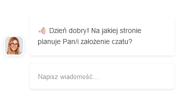
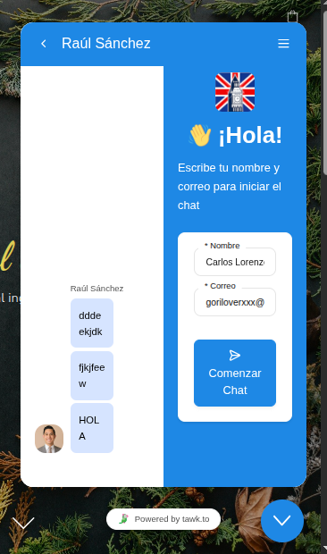
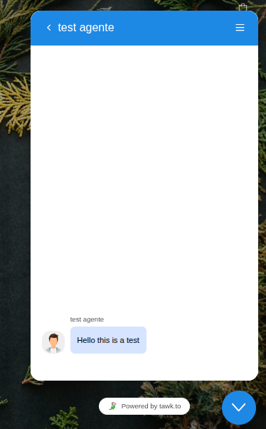
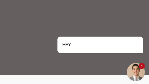
It’s absolutely crucial to remember that average user’s attention span is getting shorter and shorter. Tawk.to triggers are great, but they do have lots of additional elements, which can and will draw user’s attention away from the message itself. This can be fixed really easily, even if we’d like to stick to the original font  :
:
Most importantly, it doesn’t require any complicated coding to achieve. I mean for you - since there’s no CSS panel or changes allowed for user in the widget ://
(I’ve checked all the classes, so they should correspond if you add them to the direct document):
To round the corners ( you can adjust the value to make it look more wholesome, I can’t test it in real time, cuz again you don’t allow us to implement our own CSS  )
)
.tawk-card.tawk-card-small.tawk-has-avatar.tawk-box-shadow-xsmall.tawk-message.tawk-margin-auto-left {
    border-radius: 17px !important;
}
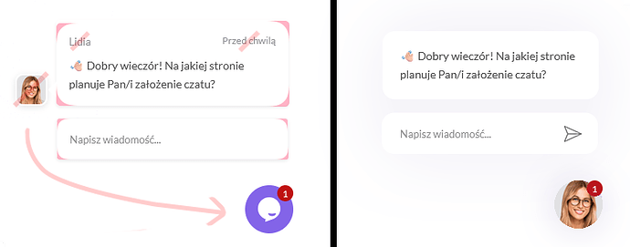
Remove timeago and flex classes
Trust me this is really distracting and just doing so will clean the whole design, but if you can’t remove them, you can just insert this code snippet:
.tawk-card .tawk-flex .flex-auto {
    display: none !important;
}

.tawk-card .tawk-flex .tawk-timeago {
    display: none !important;
}
You can check my Photoshop edit of it:

Then to add shadow:
.tawk-card.tawk-card-small.tawk-has-avatar.tawk-box-shadow-xsmall.tawk-message.tawk-margin-auto-left {
box-shadow: 0 4px 20px rgba(96, 70, 160, 0.07) !important;
}
For reference, I encourage you to take a look at other chat software triggers mentioned earlier  . Of course these are just and only suggestions, but again implementing those changes will take a few seconds and will set your software miles apart from your competitors!
